ShopDreamUp AI ArtDreamUp
Deviation Actions


![Raven [DC Comics]](https://images-wixmp-ed30a86b8c4ca887773594c2.wixmp.com/f/cac4b84c-5b56-42a8-853a-942cdafe786b/dd1xva4-02d5fdba-34de-49d0-976e-099515839669.jpg/v1/crop/w_184,h_184,x_0,y_23,scl_0.067399267399267,q_70,strp/raven__dc_comics__by_faerieblossom_dd1xva4-92s-2x.jpg?token=eyJ0eXAiOiJKV1QiLCJhbGciOiJIUzI1NiJ9.eyJzdWIiOiJ1cm46YXBwOjdlMGQxODg5ODIyNjQzNzNhNWYwZDQxNWVhMGQyNmUwIiwiaXNzIjoidXJuOmFwcDo3ZTBkMTg4OTgyMjY0MzczYTVmMGQ0MTVlYTBkMjZlMCIsIm9iaiI6W1t7ImhlaWdodCI6Ijw9MTM1MSIsInBhdGgiOiJcL2ZcL2NhYzRiODRjLTViNTYtNDJhOC04NTNhLTk0MmNkYWZlNzg2YlwvZGQxeHZhNC0wMmQ1ZmRiYS0zNGRlLTQ5ZDAtOTc2ZS0wOTk1MTU4Mzk2NjkuanBnIiwid2lkdGgiOiI8PTkwMCJ9XV0sImF1ZCI6WyJ1cm46c2VydmljZTppbWFnZS5vcGVyYXRpb25zIl19._zs9Tfssq_YiPMsd8CCjTDerkqGopdoWD_-qqGsxVQ0)
![Raven [DC Comics]](https://images-wixmp-ed30a86b8c4ca887773594c2.wixmp.com/f/cac4b84c-5b56-42a8-853a-942cdafe786b/dd1xva4-02d5fdba-34de-49d0-976e-099515839669.jpg/v1/crop/w_92,h_92,x_0,y_12,scl_0.033699633699634,q_70,strp/raven__dc_comics__by_faerieblossom_dd1xva4-92s.jpg?token=eyJ0eXAiOiJKV1QiLCJhbGciOiJIUzI1NiJ9.eyJzdWIiOiJ1cm46YXBwOjdlMGQxODg5ODIyNjQzNzNhNWYwZDQxNWVhMGQyNmUwIiwiaXNzIjoidXJuOmFwcDo3ZTBkMTg4OTgyMjY0MzczYTVmMGQ0MTVlYTBkMjZlMCIsIm9iaiI6W1t7ImhlaWdodCI6Ijw9MTM1MSIsInBhdGgiOiJcL2ZcL2NhYzRiODRjLTViNTYtNDJhOC04NTNhLTk0MmNkYWZlNzg2YlwvZGQxeHZhNC0wMmQ1ZmRiYS0zNGRlLTQ5ZDAtOTc2ZS0wOTk1MTU4Mzk2NjkuanBnIiwid2lkdGgiOiI8PTkwMCJ9XV0sImF1ZCI6WyJ1cm46c2VydmljZTppbWFnZS5vcGVyYXRpb25zIl19._zs9Tfssq_YiPMsd8CCjTDerkqGopdoWD_-qqGsxVQ0)


Comments8
Join the community to add your comment. Already a deviant? Log In
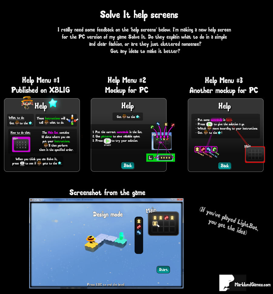
I like the layout of the first one, it's really neat. I also like that it states what you're supposed to do First. The final part "When you think you can Solve It..." is good too. The part in between though, I think could use a little touch-up.
The word 'Instructions' kind of confused me at first, because I thought you were referring to the help instructions in the help menu (the ones I was in the process of reading). A simple misunderstanding that passed quickly! It's a good word, although I probably would have called them 'Directives' instead. Then to make their connection to the 'Main list' more obvious and explanatory I would've called it the 'Directives list' (so if you prefer the word 'Instructions' I would've called it the 'Instructions list')
Basically I would have put the whole thing like this:
"What to do: Get 'avatar' to the 'star'.
Use the 'Directives list' to give 'avatar' 'Directives' to follow in order to get to the 'star'.
(To go with this I would've used pictures like the ones in Help Menu #3. Instead of the red color in #3 I would've gone for the green color. I also would've skipped the lines between the words and the windows because I found it a bit messy. I think the connection between the two was clear the way it was in mockup #1.)
When you think you can Solve It, press 'start' to see if 'avatar' gets to the 'star'."
Hope that wasn't too confusing and that it helped!